Kitchen of the Week: Light-Filled Addition for a 1920s Home
A designer creates a cohesive new kitchen that balances modern function with period-appropriate style

Built in the 1920s, this Colonial Revival home in Providence, Rhode Island, was rich with period character, including Craftsman-style detailing. But the kitchen didn’t share in that charm. Small and inefficient, it fell short for a family with two young daughters. Looking for a space that better supported everyday life, the homeowners hired Jonathan Chambers Architects, Wescott Building & Remodeling and Three Sparrows Interior Design to create an addition that would expand the kitchen and make it more family-friendly.
To integrate the addition, the remodeling team took the existing kitchen down to the studs for a full overhaul. Interior designer Nicole Martel worked closely with the couple to develop a layout tailored to how they wanted to use the space and choose finishes that felt appropriate for the home’s period architecture. The new kitchen features an island large enough to seat the whole family, a second oven for holiday cooking and a walk-in pantry concealed behind false cabinet doors.
To integrate the addition, the remodeling team took the existing kitchen down to the studs for a full overhaul. Interior designer Nicole Martel worked closely with the couple to develop a layout tailored to how they wanted to use the space and choose finishes that felt appropriate for the home’s period architecture. The new kitchen features an island large enough to seat the whole family, a second oven for holiday cooking and a walk-in pantry concealed behind false cabinet doors.
Before Photo
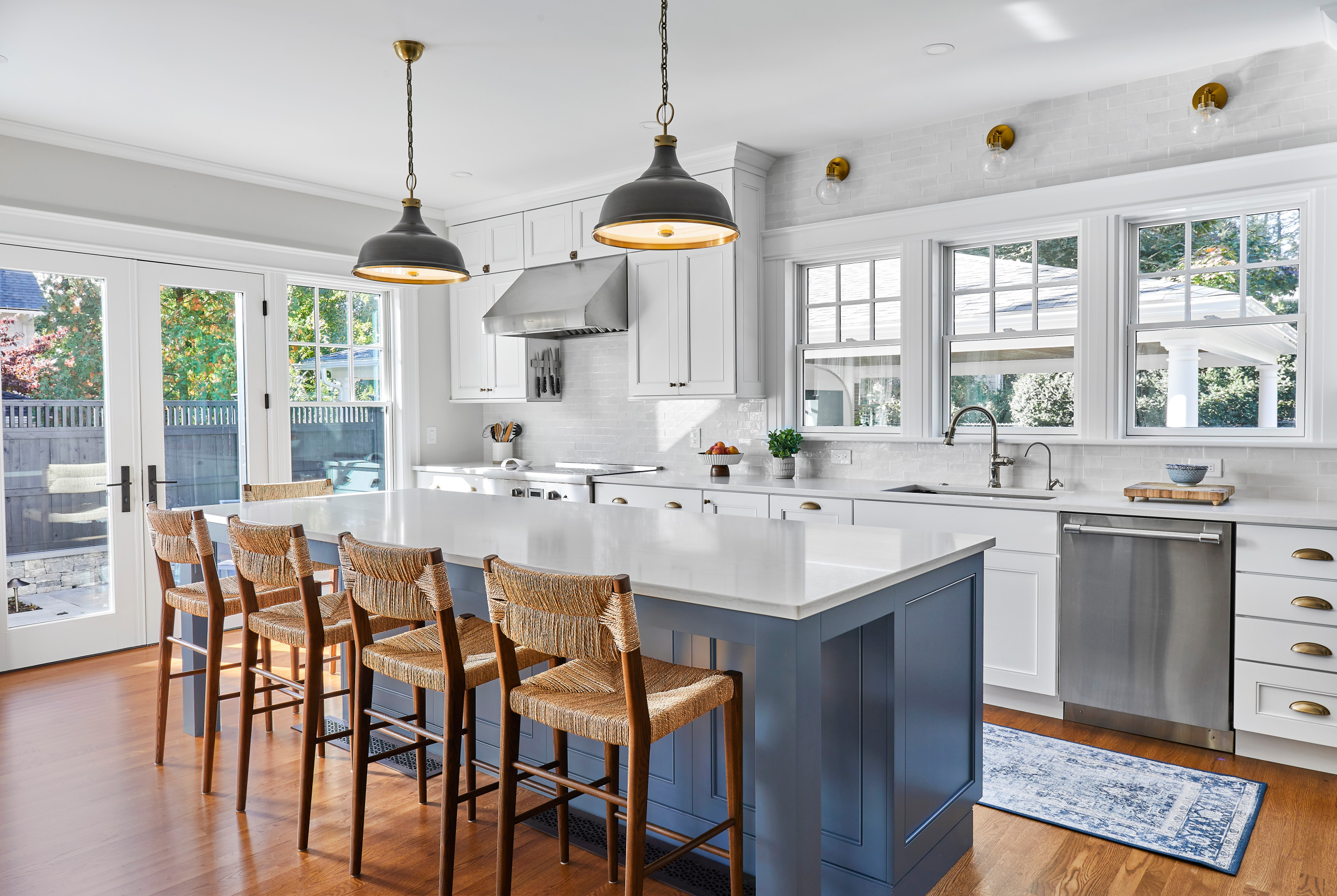
After: To orient the before-and-after photos, note that the sink remains in the same location. The expansion added 150 square feet to the kitchen, making room for a generously sized island measuring 9½ by 3½ feet — plenty of space for the entire family to gather for meals. The addition also allowed for expansive windows and glass doors that flood the room with natural light.
To help the new kitchen feel seamlessly connected to the rest of the house, the team matched the home’s existing window style and repeated the same trim details, including crown molding, baseboards and window casings. Martel also suggested vintage-style light fixtures, aged brass finishes, Shaker-style cabinetry with a beaded detail, marble-look countertops and vintage-inspired hardware such as cup pulls and latches, all of which reference the home’s 1920s roots.
The countertop stools introduce a woven texture and are also practical. “We love to bring wood tones in to warm up a space,” Martel says. “Fabric options were not the best idea for young kids. These were a good alternative.”
Wall paint: Classic Gray, Benjamin Moore
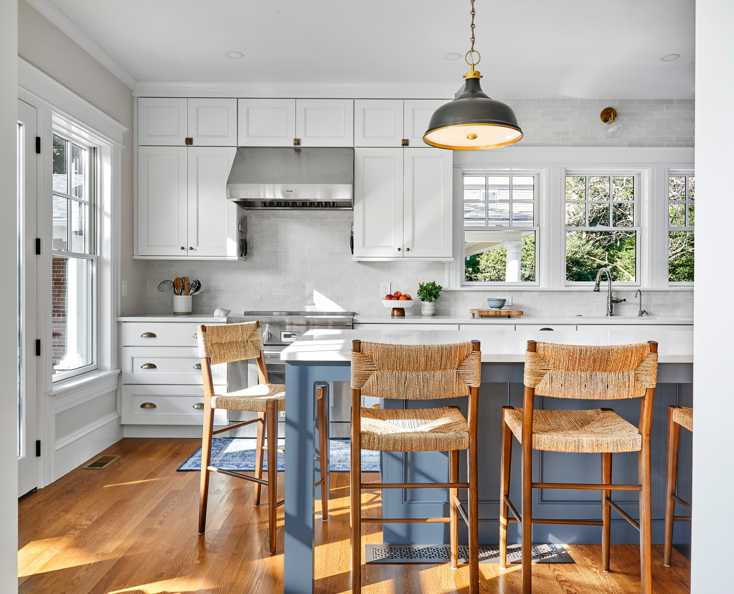
Though rooted in the home’s history, the kitchen also feels fresh and updated. “We wanted to give the kitchen a clean and classic look,” Martel says. A two-tone color scheme for the cabinetry keeps things fresh. White cabinets, a light-colored backsplash and London Fog quartz countertops help make the kitchen light and bright. Meanwhile, a blue-gray hue on the island and other cabinets in the room provides calming contrast. “This is such a nice neutral blue. It’s not too bold,” Martel says. “It looks more blue or more gray depending on the time of day.”
For the backsplash, Martel recommended tiles with a handcrafted feel. “These zellige tiles have a little bit of variance in color and size,” she says. “They bring personality and character into the room.” Above, a trio of glass-and-brass sconces casts a soft wash of light across the wall.
Pendant lights: Hudson Valley Lighting; counter stools: Serena & Lily; faucet: Artesso, Brizo; cabinets: Fresh Snow and Stonehedge finishes, Covered Bridge Cabinetry
Find an interior designer on Houzz
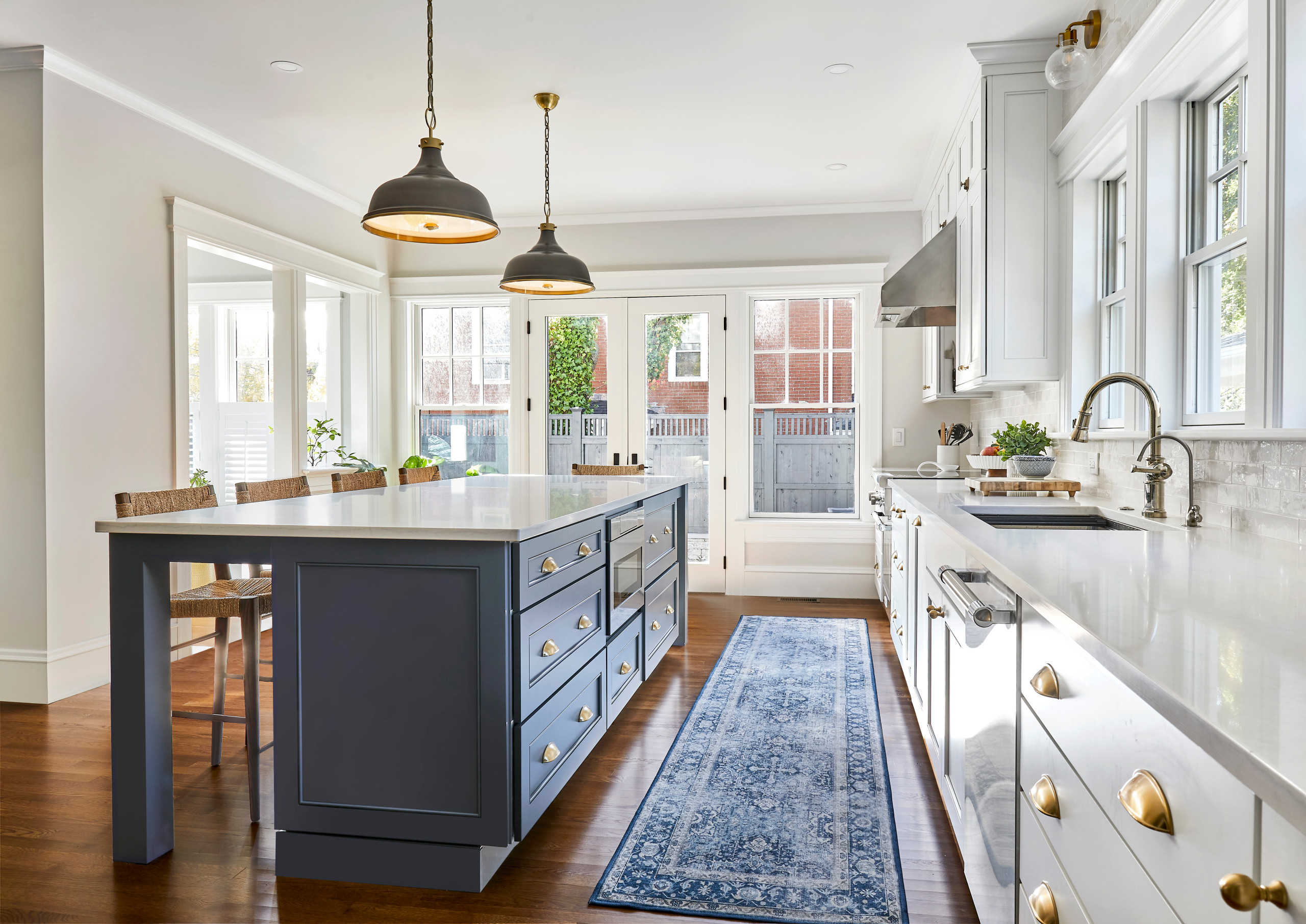
The working side of the island is packed with smart storage, including deep drawers for pots and pans near the range, a microwave drawer and smaller drawers for everyday items. One silverware drawer features two tiers of inserts, doubling its capacity. A charging drawer to the right of the dishwasher keeps devices tucked away and off the counter.
Polished nickel finishes on the main faucet and water filter faucet add a traditional touch. The finish also helps visually tie in the stainless steel appliances as part of a cohesive mixed-metal approach.
A patterned runner adds softness underfoot at the sink and helps disguise the wear and tear that comes with two energetic young children.
25 Kitchen Storage Features Pros Swear By
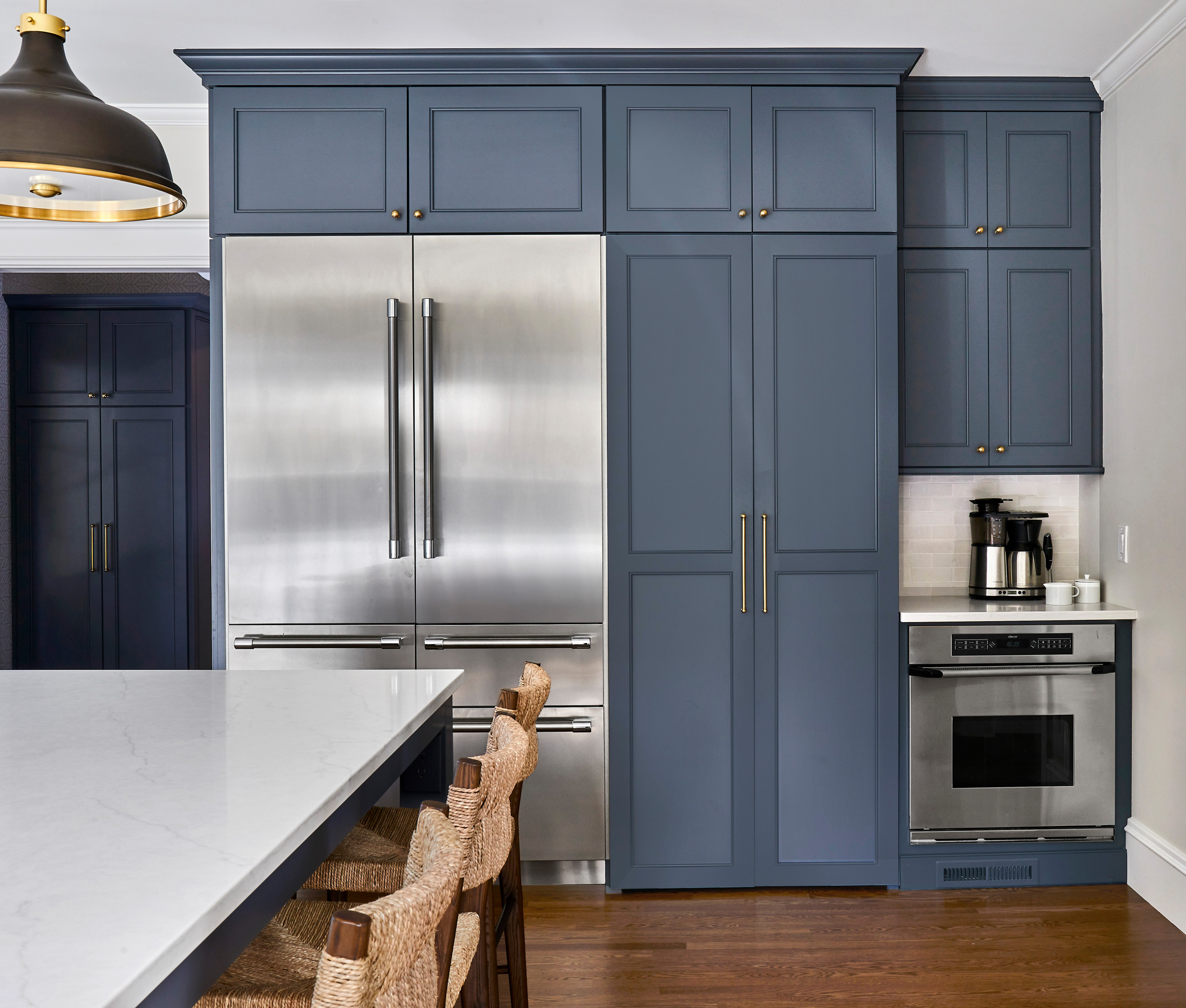
Originally, this wall was slated to hold the refrigerator and a pantry door, with a separate coffee station planned for the wall to the right. That layout would have left only a narrow opening to the dining room, located just beyond the right edge of the photo. Knowing her clients wanted a stronger connection between the two spaces, Martel reworked the plan by incorporating the coffee station into this run of cabinetry, which allowed for a 4½-foot-wide opening to the dining room.
In addition, the homeowners already had this second oven and knew how handy it would be when hosting big holiday meals. Martel placed it along this wall and knew the area above it was the perfect place for the coffee station. She also scrapped the standard pantry door, as it chopped up this wall and made the fridge stick out like a sore thumb.
Check out our guide to get started on your home project
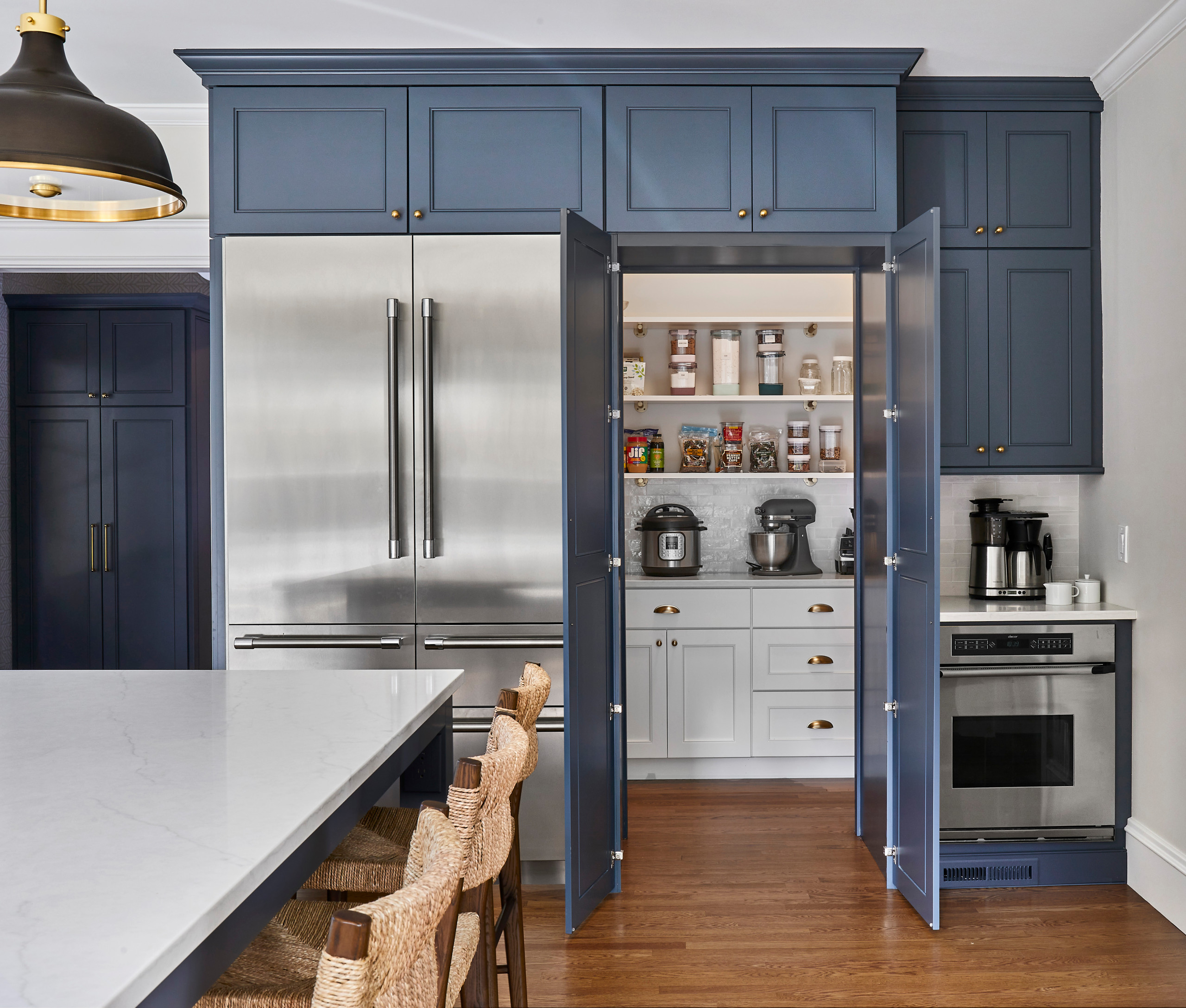
To better integrate the refrigerator, Martel designed a surround with two false cabinet doors that open to a walk-in pantry. Inside, custom shelves and cabinets accommodate specific items like canned goods and water bottles. There’s also space for countertop appliances, plus a dedicated area to the right for brooms, mops and the vacuum cleaner.
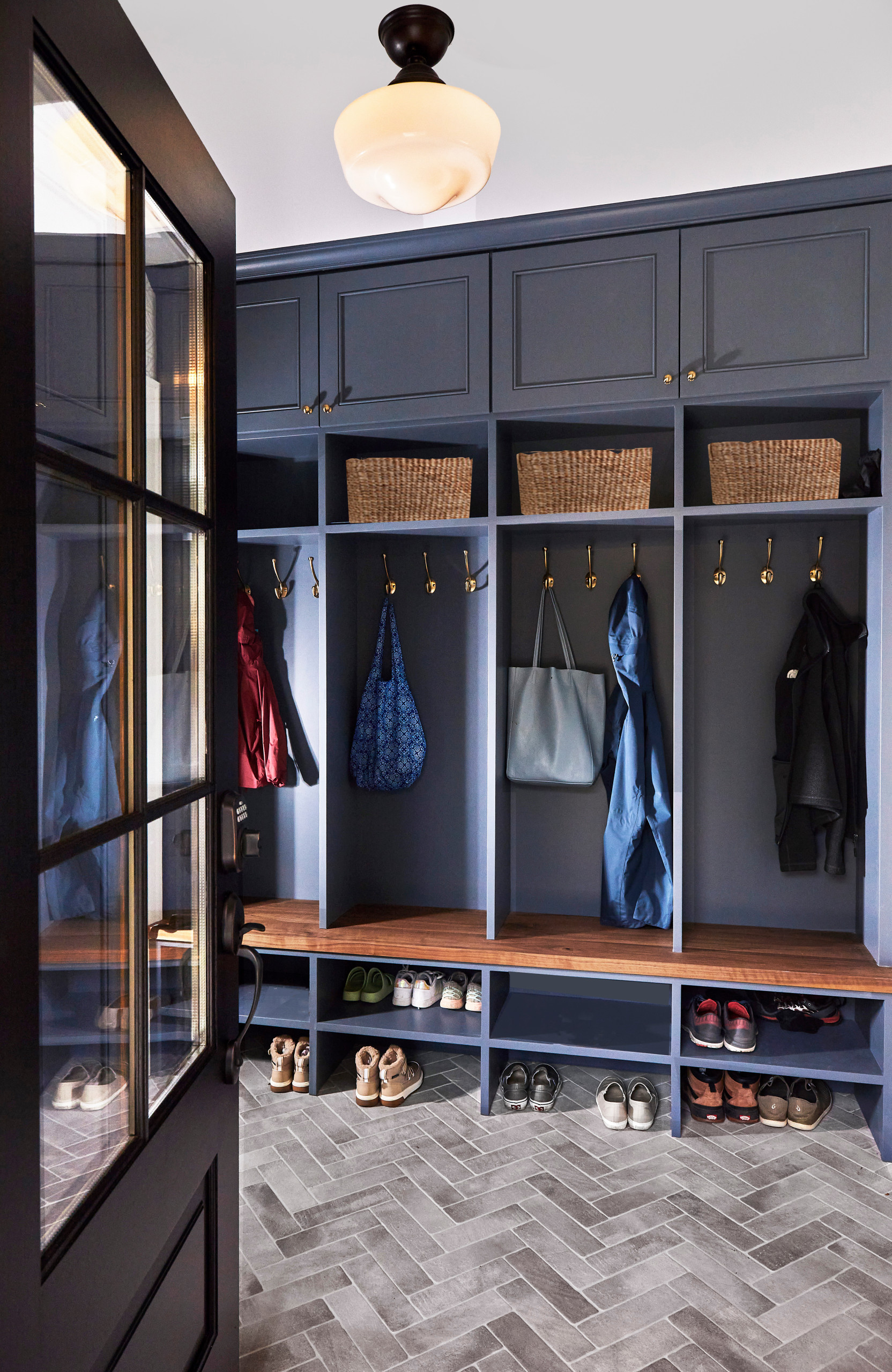
Behind the refrigerator and pantry, the project also included a reconfigured mudroom. Because it’s visible from the kitchen, Martel repeated the beaded Shaker cabinetry and blue-gray finish, allowing the storage to visually recede while creating continuity between the two spaces.
Each family member has their own locker in the mudroom. Anticipating lots of shoes, the designer added shelving to double the capacity of the shoe cubbies. Upper cabinets provide storage for out-of-season gear.
See why you should hire a professional who uses Houzz Pro software
Each family member has their own locker in the mudroom. Anticipating lots of shoes, the designer added shelving to double the capacity of the shoe cubbies. Upper cabinets provide storage for out-of-season gear.
See why you should hire a professional who uses Houzz Pro software
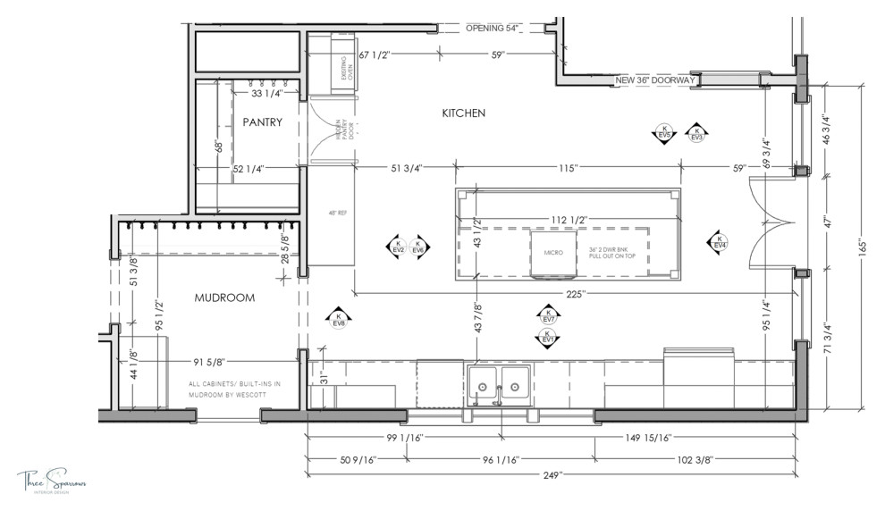
Floor plan: The addition appears on the right side of the plan, with the dining room above the opening at the top. The placement of windows, doors and the wide opening to the dining room helped determine appliance locations. Even so, the large island anchors an efficient work triangle. Ingredients can be taken from the refrigerator or pantry and set on the island, making them easy to access for rinsing, prepping and cooking.
Today, the remodeled kitchen functions as the heart of the home, offering ample space for family meals, homework sessions and keeping the cook company. It connects seamlessly to the mudroom, dining room and backyard, supporting the rhythms of daily life. Durable materials such as quartz countertops, woven stools and a patterned runner stand up to the demands of a busy household, while thoughtful vintage-inspired details ensure the kitchen feels right at home in its historic setting.
More on Houzz
Read more kitchen stories
Browse kitchen photos for ideas
Find home design and construction professionals

Sponsored
Kitchen at a Glance
Who lives here: A couple and their two young daughters
Location: Providence, Rhode Island
Size: 317 square feet (29 square meters)
Designers: Three Sparrows Interior Design and Jonathan Chambers Architects
Builder: Wescott Building & Remodeling
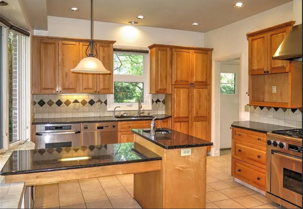
Before: The kitchen had been renovated previously, and many of the original details were gone. While the compact size was the biggest drawback, the room also had some awkward features, including a second sink positioned in the middle of the space.
To gain the square footage they needed, the homeowners built an addition. The new construction pushed the wall to the left out approximately 8½ feet.
Find a general contractor on Houzz